
Case Studies Design Style Guide
Exactly how to build a case studies web page.

Hey there, future case study creator. Here a little background on the basics of our website.
Our site is a CMS (content management system). The site is responsive and contains one breakpoint. At a width of 767 pixels, the display switches from desktop view to mobile. All images allow for an alternate version upload for the mobile display (except for images in standard blocks because standard blocks are already just 1 column).
CONTENT BLOCKS & SPACER OPTIONS
When adding content to your webpage, you have 4 content block options & a spacer.
** pro tip 1: you can leave any text or image column blank to have that space work as transparent “padding” in that column
** pro tip 2: for mobile display, all multi-column blocks are turned into a single column grid. Any columns that sit next to each other will now be stacked on top of each other in mobile display
Standard:
I’m a 1 column standard block.
I allow you to easily craft content like you would in a regular document.
You can put text, image, or other types of content in me.
You can give me a bg color or image.
Two up:
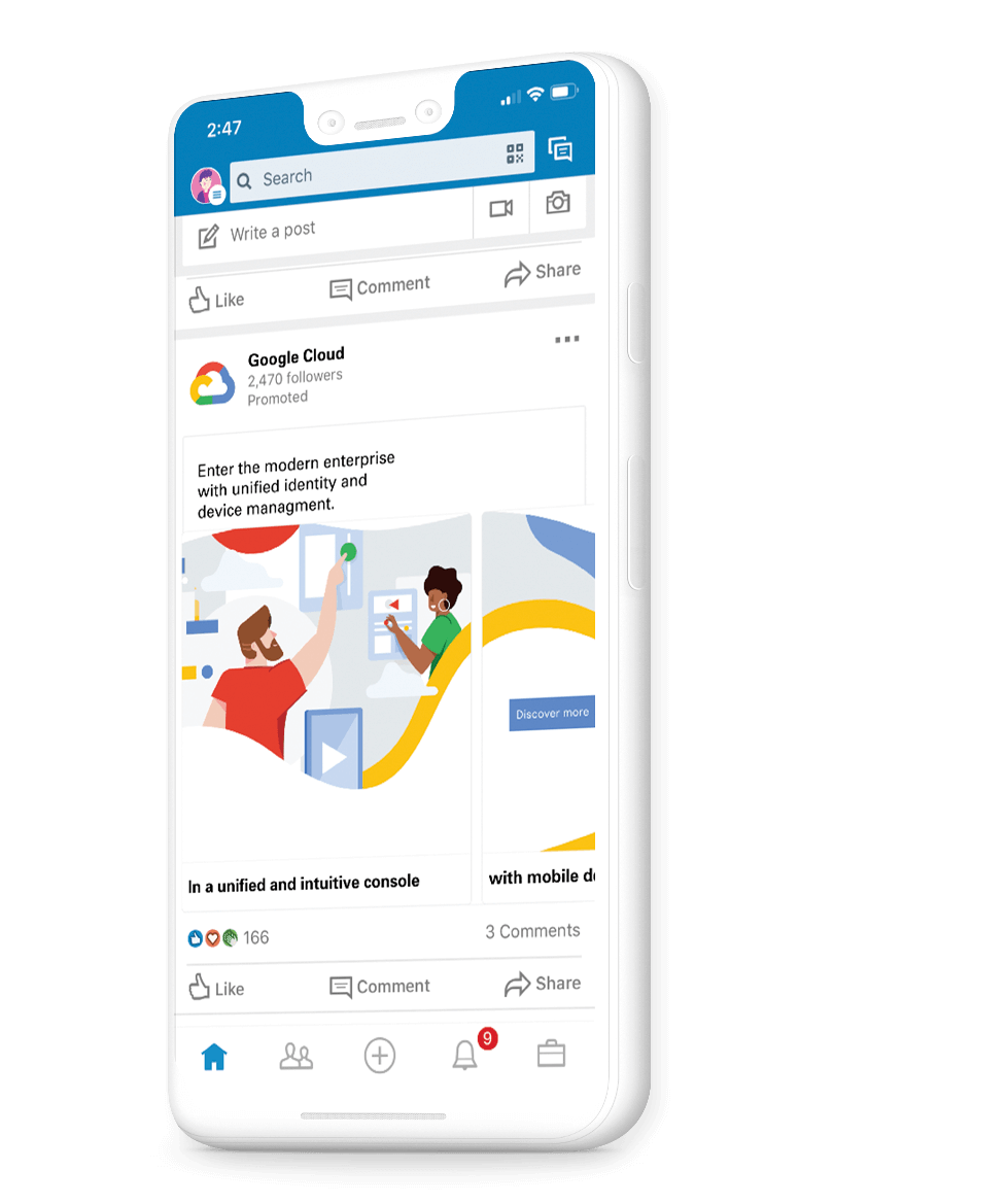
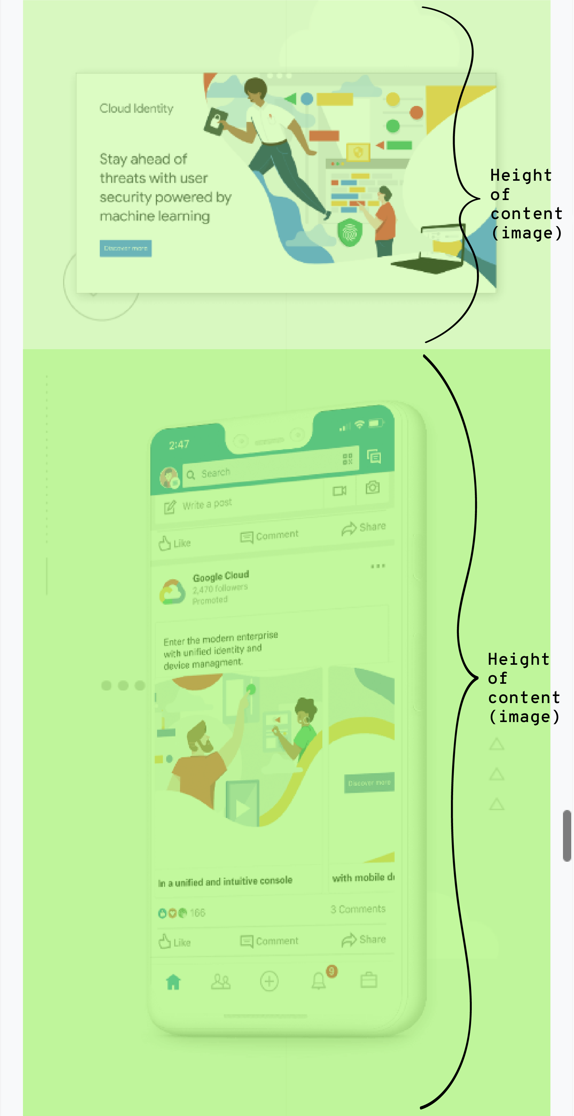
Below is a 2 column block.
It can have text or image in either column.
The 2 columns can be as big or small as you want, as long as their widths total 100.
You can give the entire section a bg color or image.


Three up:
Below is a 3 column block.
It can have text or image in any of its 3 columns.
Think of it when you want 3 elements side-by-side.
The total of its 3 widths need to equal 100.
You can give the entire section a bg color or image.
Four up:
Below is a 4 column block.
It can have text or image in any of its 4 columns.
Think of it when you need to control padding between elements.
Or if you want 4 elements side-by-side.
The total of its 4 widths need to equal 100.
You can give the entire section a bg color or image.
Spacer:
I’m a spacer block.
I add a horizontal transparent block wherever I am placed.
You can control my height and my bg color.
Here, my height is set to 100 pixels and my bg color is #f9cbc5.
TYPE OPTIONS:
Standard blocks (1 column sections) allow for:
Heading 1:
Poppins, Semi Bold; Weight: 600; Size: 80px; Line Height: 84px
** use for page heading/project name
Heading 2:
Poppins, Semi Bold; Weight: 600; Size: 40px; Line Height: 48px
** use for section heading
Heading 3:
Lora, Regular; Weight: 400; Size: 30px; Line Height: 38px
** use for section subheading
Heading 4:
Poppins, Semi Bold; Weight: 600; Size: 30px; Line Height: 36px
** use for page/project subheading and subheading in standard text blocks
Heading 5:
Poppins, Bold; Weight: 700; Size: 15px; Line Height: 27px
** use for emphasized body copy
Heading 6:
Poppins, Bold; Weight: 700; Size: 12px; Line Height: 27px
** use for captions
Preformatted:
Overpass Mono, Normal; Weight: 400; Size: 18px; Line Height: 27px
** use for call to action
Paragraph:
Poppins, Regular; Weight: 400; Size: 16px; Line Height: 24px
** use for body copy
Text in column blocks
Heading text is smaller here than in standard blocks
Subheading text uses Lora
Body text is to tell a detailed story or lengthy explanation. It pairs well with images — whether it be above, below, or next to them.
Heading: Poppins, Semi Bold; Weight: 600; Size: 30px; Line Height: 42px
Subheading: Lora, Regular; Weight: 400; Size: 22px; Line Height: 30px
Body Text: Poppins, Regular; Weight: 400; Size: 16px; Line Height: 24px